Gartine – De Lieve Groene Stad
Design & Development (Mobile Website)
View prototype ↗About this project
For the individual project “De Lieve Groene Stad”, I designed and developed a mobile-first website for an initiative in Amsterdam that supports a greener and more sustainable lifestyle.
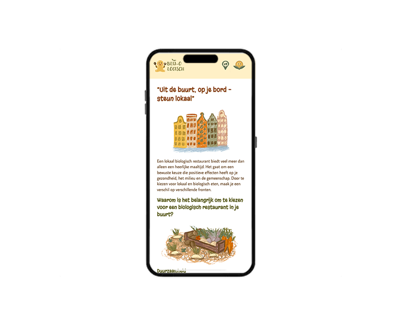
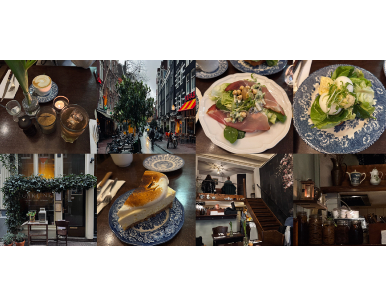
I walked through Amsterdam to choose an initiative myself and selected Gartine, a biological and sustainably focused restaurant. I visited the location, ate there and photographed the dishes to use as content in my design.
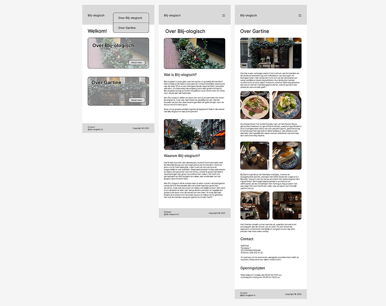
I first created the full design in Figma, focusing specifically on mobile only UI. The assignment required designing for a small screen only, so the final coded version is not completely responsive.
After designing the layout, interactions and visual style, I built the mobile website using HTML and CSS.
Before design
At the project kick-off, we received a QR code with a route of initiative locations in Amsterdam. We followed this route to choose a location and create a website. I visited Gartine, an organic restaurant with its own vegetable garden and chemical-free produce. I also ate there and really enjoyed the food, atmosphere, and friendly staff. The name of my website is “Blij-ologisch,” combining biologisch (organic) and blij (happy).
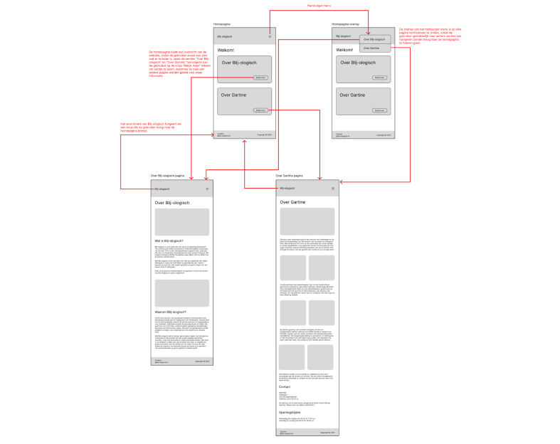
First, I created the sitemap for my website, defining how many pages there are, what types of pages they are, and which elements they contain. This helps keep everything clear and structured when I start designing and coding.
Lofi design
I first design using wireframes with real text and already add the photos. The screen layout is not fully refined yet, and the homepage is not very engaging. I still need to add texts that spark people’s interest and encourage them to read further, instead of immediately directing them to other pages. I am also still missing a clear introduction to the website.
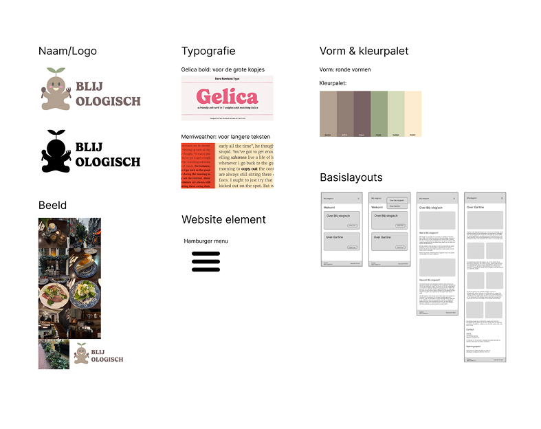
I first created a stylesheet, including the logo, color palette, and typography. The soft earth tones were too gray, making the design feel gloomy and not matching the website’s name. I initially used a hamburger menu, but since the site only has three pages in total, it was unnecessary. Using icons in the navigation bar is a better choice.
Hifi design
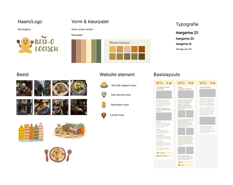
In this 2.0 stylesheet, I used brighter colors to create a happier atmosphere that better fits the website’s name. I simplified the logo while keeping it playful, and the character now looks happier. I also chose a more playful font to match the logo. I designed all icons and illustrations myself, keeping a consistent style. The icons are unique, easy to understand, and are used for navigation instead of a hamburger menu.
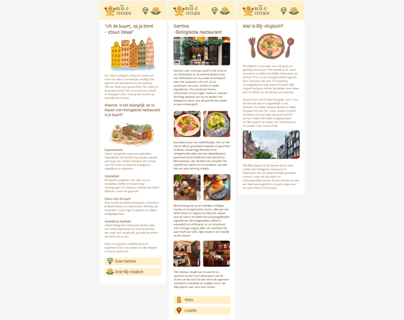
Bescause of the clear stylesheet and sitemap, I could work faster and focus on the visual design. The website looks cheerful, and the illustrated elements fit the overall style. After finalizing the design in Figma, I built the website using HTML and CSS. The project is assessed on mobile screens, but bonus points are available for responsiveness. I made the site responsive in terms of element scaling, although the layout is not yet fully optimized for all screen sizes.