Boekenzoeker - a bookfinder
Visual Interface Design (Figma)
View prototype ↗About this project
For the Visual Interface Design course, I designed an iPad kiosk interface called Boekenzoeker. The goal of the assignment was to help primary school students quickly find interesting books in the school library.
The interface lets students select a few preferences, such as genre and type of story, and then generates a list of book suggestions that match their interests. From there, they can add titles to a personal wishlist and email that list to themselves, so they can easily find the books in the physical shelves.
I worked within the existing brand style of Gemeente Amsterdam, but created a substyle for younger students: more playful typography, clearer icons and a friendly colour palette. At the same time, I designed functional screen layouts that focused on clarity, hierarchy and ease of use on a single iPad screen.
The design process followed a structured step-by-step approach, where I developed the visual style and the screen flows in parallel. The final result is a focused, tablet-only interface that guides students from starting the kiosk to walking into the library with a curated list of books.
LoFi design
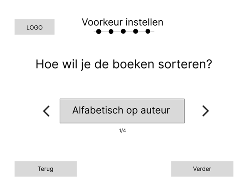
For the low-fidelity design, I choose to place the options on the selection screens large and centered, so that the user’s attention is focused on them, with arrows on the left and right to make a choice.
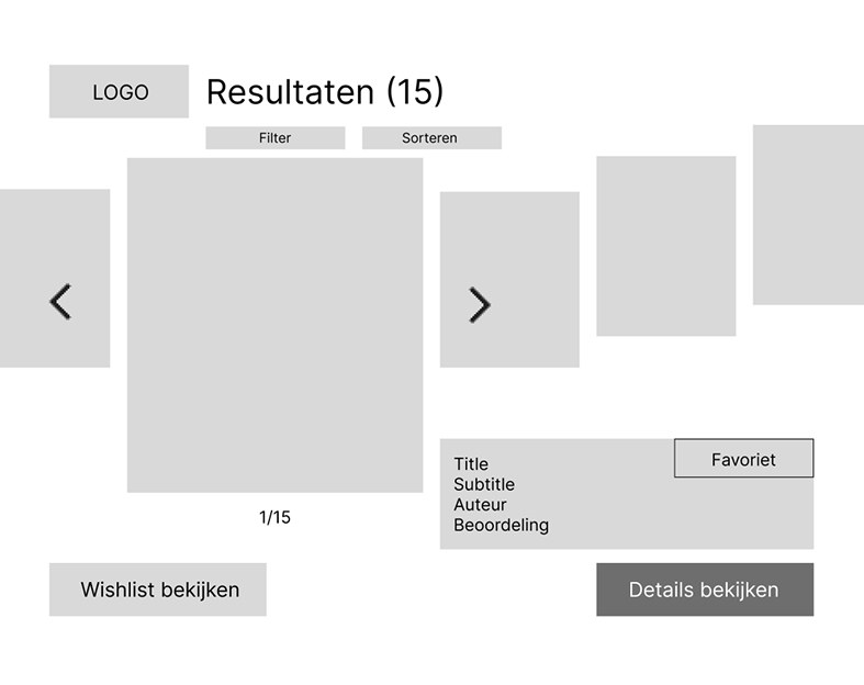
I chose a carousel-like layout because it allows the user to anticipate what comes next and see what was shown before. In addition, brief information about the book itself is displayed.
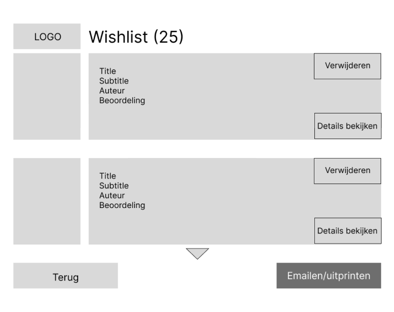
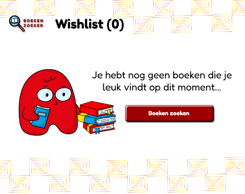
The wishlist is simple and clear in a list format. You can see which books you have liked, and brief information about each book is shown to help give you ideas.
HiFi design
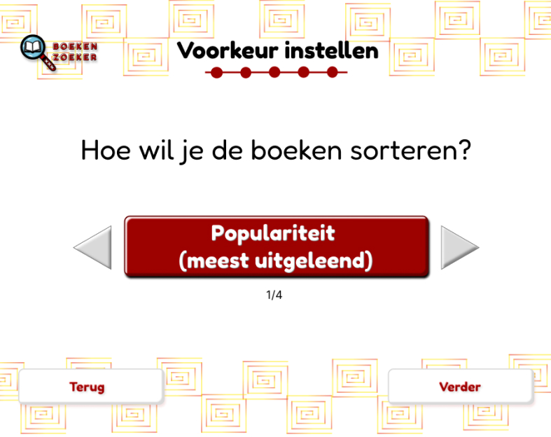
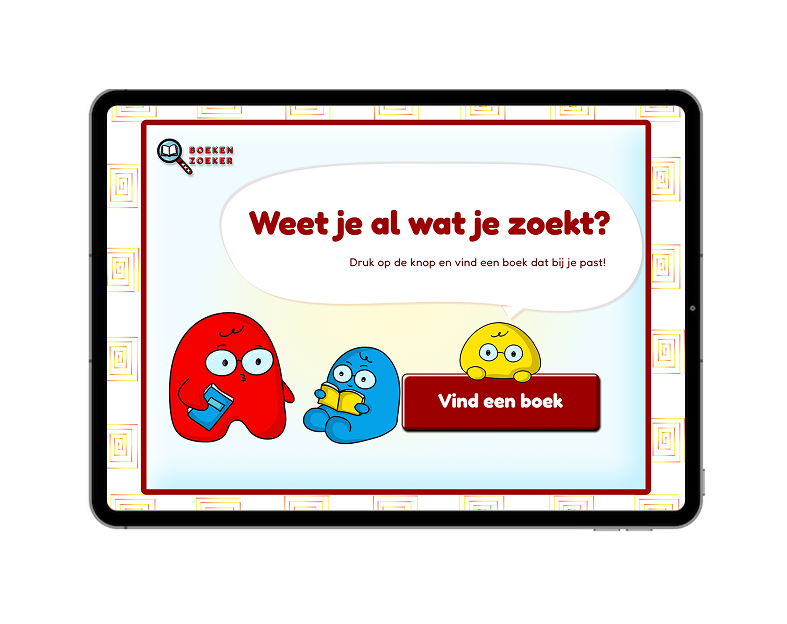
I used dark red to attract the user’s attention, and it also fits the visual identity of Gemeente Amsterdam.
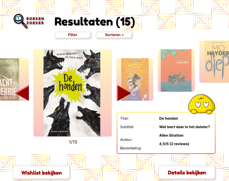
I also added illustrations to make the design more playful and better suited to a younger audience. Bright colors are used to create a fresh and lively feeling.
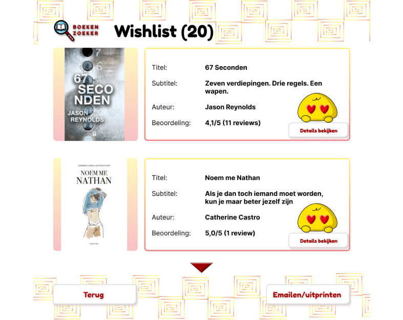
The illustration I designed for the favorite button is unique and easy to understand in terms of what the button does and it is also playful.
States illustration
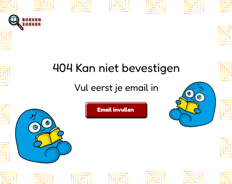
Error state
Empty state
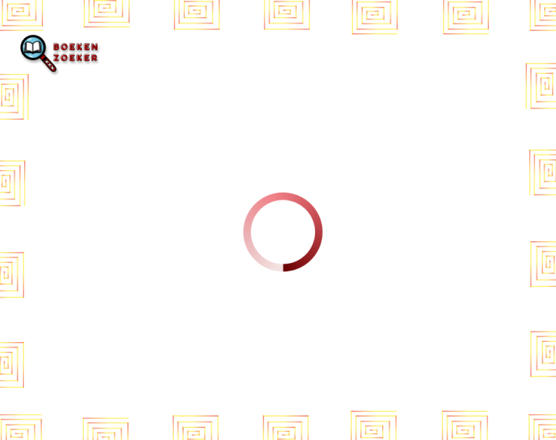
Loading state
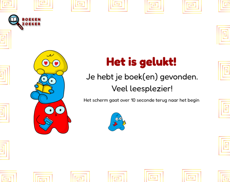
Done state